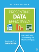
Now in striking full color, the Second Edition shows readers how to make the research results presented in reports, slideshows, dashboards, posters, and data visualizations more interesting, engaging, and impactful. The book guides students, researchers, evaluators, entrepreneurs, and non-profit workers—anyone reporting data to an outside audience—through design choices in four primary areas: graphics, text, color, and arrangement. The Second Edition features an improved layout with larger screenshots, a review of the recent literature on data visualization, and input from a panel of graphic design experts.
Inhaltsverzeichnis
About the Author
Acknowledgments
Preface to the Second Edition
1 The Justification for Presenting Data Effectively
Learning Objectives
What Does Effective Data Presentation Look Like?
What Makes Data Presentation Effective?
What Do I Need to Develop Effective Data Presentation?
How Do I Navigate This Book?
What Is the Bottom Line?
Key Points to Remember
How Can I Extend This?
Where Can I Go for More Information?
2 Graphics
Learning Objectives
Guiding Ideas
How Do I Use Images in Effective Ways?
How Do I Efficiently Locate High-Quality Images?
Where Should Graphs Go?
How Do I Apply These Ideas to Graphs?
What Is the Bottom Line?
Key Points to Remember
How Can I Extend This?
Where Can I Go for More Information?
3 Text
Learning Objectives
Guiding Ideas
What Is Type?
How Do I Tell These Typefaces Apart?
What Works for Paper and What Works for Screen?
Did You Just Say I Can’t Use Calibri?
How Can I Protect Font Choices?
How Do Fonts Actually Communicate?
What Font Size Should I Use?
How Should Lines Be Spaced?
How Does Typeface Help Organize Data Presentation?
How Do I Apply These Ideas to Graphs?
What Is the Bottom Line?
Key Points to Remember
How Can I Extend This?
Where Can I Go for More Information?
4 Color
Learning Objectives
Guiding Ideas
Why Is Color Important to Memory?
What Colors Should I Choose?
What Should I Watch Out For?
How Do I Apply Emphasis Colors?
How Do I Apply These Ideas to Graphs?
What Is the Bottom Line?
Key Points to Remember
How Can I Extend This?
Where Can I Go for More Information?
5 Arrangement
Learning Objectives
Guiding Ideas
Where Do the Bits and Pieces Go?
What Is White Space and How Do I Use It?
How Should I Justify Text?
How Can I Align Using Typical Software?
When Is It Okay to Break the Rules?
How Do I Arrange the Sections of the Whole Report?
How Do I Apply These Ideas to Graphs?
What Is the Bottom Line?
Key Points to Remember
How Can I Extend This?
Where Can I Go for More Information?
6 Making It Easy
Learning Objectives
Criticism: Trying to Look Slick
Criticism: Design Is Expensive
Key Points to Remember
How Can I Extend This?
Where Can I Go for More Information?
Appendix A Report Layout Checklist
Appendix B Data Visualization Checklist
Index
Über den Autor
Dr. Stephanie D. H. Evergreen is a sought-after speaker, designer, and researcher. She is best known for bringing a research-based approach to helping others better communicate their work through more effective graphs, slides, and reports. She holds a Ph D from Western Michigan University in interdisciplinary research, which included a dissertation on the extent of graphic design use in written data reporting. Dr. Evergreen has trained audiences worldwide through keynote presentations and workshops for clients, such as Verizon, Head Start, American Institutes for Research, Brookings Institute, the Ad Council, Boys and Girls Club of America, and the United Nations. She led the first known attempt to revamp the quality of presentations for an entire association: the Potent Presentations Initiative for the American Evaluation Association (AEA). She is the 2015 recipient of the AEA’s Marcia Guttentag Promising New Evaluator Award, which recognizes early notable and substantial accomplishments in the field. Dr. Evergreen is coeditor and coauthor of two issues of New Directions for Evaluation on data visualization. She writes a popular blog on data presentation at Stephanie Evergreen.com. Her book, Presenting Data Effectively: Communicating Your Findings for Maximum Impact, was published by Sage in Fall 2013 and was listed as number one in Social Science Research on Amazon in the United States and United Kingdom for several weeks.


