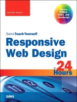
Learn responsive web design (RWD) with HTML5, CSS3 & Java Script in just 24 one-hour lessons Sams Teach Yourself Responsive Web Design in 24 Hours helps you create websites that work equally well on everything from smartphones and tablets to multi-screen monitors. This book’s straightforward, step-by-step approach shows how to use HTML, CSS, and Java Script to build the responsive sites today’s users and clients want. In just a few hours, you’ll be building layouts, sites, forms, and web apps that automatically adapt to virtually any device. Every lesson builds on what you’ve already learned, giving you a rock-solid foundation for real-world success. Learn how to… Create effective and reliable responsive designs with CSS3, HTML5, and Java Script Use progressive enhancement to consistently provide the right content while making the most of each device and browser Establish breakpoints and write CSS media queries to respond appropriately to each user agent Choose the right layout and wireframing approach for your site Use web fonts to control typography and choose sizes that look good on any device Master three ways to make tables responsive Build responsive forms using the latest HTML5 tags and attributes Implement responsive navigation patterns that users understand intuitively Test for responsiveness and performance Use Responsive Design + Server Side Components (RESS) to optimize performance CONTENTS AT A GLANCE PART I: INTRODUCTION TO RESPONSIVE WEB DESIGN HOUR 1: What Is Responsive Web Design? * History of Responsive Web Design * Why We Need Responsive Web Design HOUR 2: Alternatives to Responsive Web Design* Table-Based Layouts * CSS Layouts * Detection Scripts HOUR 3: The Growth of Mobile * Basic Cell Phones * Smartphones * Tablets * Retina Devices * Why Responsive Design Is Important HOUR 4: Progressive Enhancement * What Is Progressive Enhancement? * How to Use Progressive Enhancement on a * Website * Benefits of Progressive Enhancement HOUR 5: HTML for Responsive Web Design* Using HTML5 * Clean Code * Don’t Forget Semantic Elements * Validating Your HTML HOUR 6: Basic CSS * How to Write CSS Rules * Embedded and External Style Sheets * Styling Fonts and Colors * Creating a Layout with CSS * Understanding Cascading and Specificity HOUR 7:Unobtrusive Java Script * What Is Unobtrusive Java Script? * How to Implement Unobtrusive Java Script PART II: BUILDING A RESPONSIVE WEBSITE HOUR 8: Planning a Responsive Website * Should You Make Your Website Responsive? * How to Plan for a Responsive Website HOUR 9:Mobile First * Why Design for Mobile First? * What Makes a Site Mobile Friendly? * What About Mobile Only? HOUR 10: CSS Media Queries * What Is a Media Query? * Media Query Expressions HOUR 11: Breakpoints * What Is a Breakpoint? * How to Define Breakpoints in CSS * Optimal Breakpoints HOUR 12: Layout * What Is Web Layout? * Types of Layouts * Columns in Layout HOUR 13: Navigation * Why Responsive Navigation Is Important * What Makes Navigation Mobile Friendly? * Basic RWD Navigation Patterns HOUR 14: Responsive Fonts and Typography * Using Web Fonts * Sizing Typography * Relative Versus Absolute Font Sizes * New CSS3 Measurement Units HOUR 15: Creating and Using Images in RWD * Making Images Responsive * Improving Download Speeds * Building and Using Retina-Ready Images HOUR 16: Videos and Other Media in RWD* How to Make Videos Responsive * Making You Tube Videos Responsive HOUR 17: Tables in Responsive Web Design * Tables on Small Devices * Can Tables Be Responsive? * Where Do Layout Tables Fit in RWD? HOUR 18: Responsive Web Forms * HTML5 Forms * Making Web Forms Usable * Creating Responsive Forms HOUR 19: Testing Responsive Websites * Testing in Your Browser * Testing in a Device for All Your Breakpoints * How to Test When You Don’t Have the Devices HOUR 20: Problems with Responsive Web Design* Responsive Designs Can Be Slow * RWD Can Make More Work for Designers * Not All Customers Like Responsive Sites * RWD May Break Advertising PART III: IMPROVING RESPONSIVE DESIGN HOUR 21: Tools for Creating Responsive Web Designs* Planning and Designing Your RWD Site * HTML Element and CSS Tools * Web Editors for Building Responsive Web Pages HOUR 22: Device and Feature Detection * Why Use Detection Scripts * Modernizr * WURFL HOUR 23: Using RESS with RWD * What Is RESS? * Benefits of Using RESS * Getting Started with RESS * When to Use RESS HOUR 24: RWD Best Practices * Give Everyone the Best Experience * Use the Best Breakpoints You Can * Be Flexible and Think Small * Don’t Forget the Content * Manage Costs
Jennifer Kyrnin
Responsive Web Design in 24 Hours, Sams Teach Yourself [EPUB ebook]
Responsive Web Design in 24 Hours, Sams Teach Yourself [EPUB ebook]
Buy this ebook and get 1 more FREE!
Language English ● Format EPUB ● Pages 384 ● ISBN 9780133795936 ● Publisher Pearson Education ● Published 2014 ● Downloadable 3 times ● Currency EUR ● ID 3460380 ● Copy protection Adobe DRM
Requires a DRM capable ebook reader


