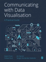
How can you transform a spreadsheet of numbers into a clear, compelling story that your audience will want to pass on?
This book is a step-by-step guide (honed through the authors′ Guardian masterclasses, workshops and seminars) to bringing data to life through visualisations, from static charts and maps to interactive infographics and motion graphics.
Introducing a four-step framework to creating engaging and innovative visualisations, it helps you to:
· Find the human stories in your datasets
· Design a visual story that will resonate with your audience
· Make a clear, persuasive visual that represents your data truthfully
· Refine your work to ensure your visual expresses your story in the best possible way.
This book also includes a portfolio of best-practice examples and annotated templates to help you choose the right visual for the right audience, and repurpose your work for different contexts.
Cuprins
Introduction: Notes from the Underground
Part 1: The Data Visualisation Process
Chapter 1: Find, design, make, refine
Chapter 2: A spectrum of right answers
Chapter 3: Find
Chapter 4: Designing Static Graphics
Chapter 5: Making Static Graphics
Chapter 6: An Introduction to Interactive Data Visualisation
Chapter 7: Designing Motion Graphics
Chapter 8: Making Motion Graphics
Chapter 9: Designing Interactive Infographics
Chapter 10: Making Interactive Infographics
Chapter 11: Refine
Chapter 12: Resources
Part 2: Finding the Right Chart For Your Story
Despre autor
Tobias Sturt has taught the Guardian′s data visualisation masterclass for the last 10 years. He has been working in digital storytelling for almost three decades in all kinds of media, from web to TV to games to infographics. He is currently the Creative Director of Add Two Digital.


